
My beautiful Copic marker honeycomb shelf
I've recently felt a strange compulsion to get back to some artistic activities, and was lucky enough to get my hand on a set of Copic alcohol markers.
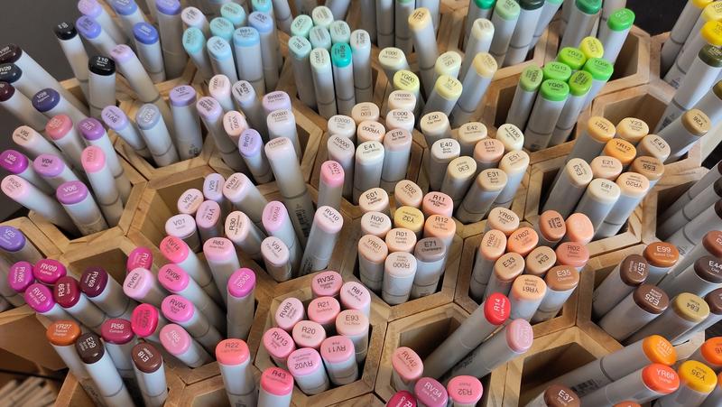
The thing is — unlike paint — with alcohol markers you don't have a small palette that you mix to create an infinite set of colors. Each marker has its own pigment, so 1 marker = 1 color. Meaning you need as many markers as you want colors in your palette.
This is the reason why you might end up with dozens, or even a couple hundred markers on your desk. Copic offers no less than 358 distinct color references.
That's… a lot. And finding your way into so many references is no small feat, especially since the colors displayed on the caps don't always represent the actual ink color with perfect accuracy.
Frustrated by how much time and effort was wasted in finding, then putting back, markers, instead of just drawing, I decided to try and find a better storage system. This led me to a small but real rabbit hole.
TL;DR If you want you can directly jump to the solution.
What problem am I solving?
Before diving into the rabbit hole, I took some time to define my requirements.
First, whenever I pick up a marker, I don't want to spend ages finding the right color. I know that at a given time, I want to pick "a dark saturated blue", or "a color between yellow and green, but closer to yellow, desaturated".
Cleaning up has to be efficient too. Say I have a dozen markers scattered on my desk: putting each one back must not require pinpointing its exact location on a fixed grid.
Last, it has to look cool as hell!
Notice how that first requirement is doing a lot of work: to find "a dark saturated blue" quickly, the storage has to be organized along the very properties I use to describe colors in my head.
So before anything else, we need to agree on what those properties are.
How we describe colors
Color is a very complicated topic, so everything that I will write here is grotesquely simplified, but we need a minimal amount of common vocabulary.
One very classical way to describe a color is by using three properties: hue, lightness and chroma.
Hue
Hue describes the color identity we perceive. It's the first thing you say when one asks you "what color is this?"
I could show you a dark saturated blue, or a vivid light blue, or a pale low-saturation blue, but you would still perceive them as "blue".
One very common way to represent that is through a color wheel. Different angles in the wheel will describe different hues.
Lightness
Lightness measures how light or dark the color is. In other terms, how close is it to pure white or pure black?
Take any image, convert it to black & white, what survives is lightness.
Chroma
Chroma describes how colorful the color is, which admittedly is not a super helpful definition.
Chroma answers the question "how strong is the hue signal?" Take a color: it's blue, but is it like a very strong unequivocally blue, or is it grey with a hint of blue?
So if lightness is "how far is this color from pure white or black?", chroma is "how far is this color from pure grey of the same lightness?".
A little visualization
To help you get a clearer idea of what hue, lightness and chroma mean, play a bit with the following widget.
Choose a hue on the wheel, and a gradient of possible colors will appear below, sorted by lightness (horizontal) and chroma (vertical).
Some perception quirks
If you have played with the widget, you may have noticed a few odd things.
All of those values measure elements of human perception. And humans are weird and quirky, and the way we perceive color is a mess.
Notice that the 2d chart is not a square, it's an inverted pyramid. When the lightness is very low (black or almost black) or very high (white or almost white), only low-chroma colors can exist.
That is quite expected, if you think about it: if a color is fully black, or fully white, it cannot also be colorful, so the closer you are to a lightness extreme, the less room you have to add color.
There are colors that simply do not exist, because we cannot perceive them!
A dark (low-lightness), vivid (high-chroma) yellow doesn't exist: lower a yellow's lightness and its yellowness dies. The closest thing you can get is olive — which is many things, but not yellow.
A pale (high-lightness), vivid (high-chroma) blue is just as impossible: a baby blue with ultramarine's punch cannot be; blue only reaches high chroma at low lightness.
And then, there are colors that exist, except we recognize them in a different name.
For example, a high-lightness red exists, but we register it as "pink".
Dark orange is not orange anymore, it's brown. In fact, many low-lightness low-chroma colors register as brown, and that's why color theorists explain that "brown is not a real color".
The reason I explain all this is to show how smart I am that colors as measured and colors as perceived don't always agree. Keep that in mind — it will come back to bite me when I try to sort the markers automatically.
The design principles
I tried to buy a ready-made dedicated shelf, but strangely I couldn't find one.
So I had to build my own.
I'm not much of a builder, so the simplest solution I could come up with was to buy wooden pencil holders and simply glue them together like a madman.
(Buying 50 pencil holders gets you strange looks unless you pretend you are a teacher.)
I wanted the end result to look and feel like a color wheel, and I was lucky enough to stumble upon hexagonal pencil holders that can be assembled to create a hexagonal shape.
But how to decide what size, how many categories, which layout?
This is a two-part question: first, decide where each color lives on the shelf and then how do you group markers together inside pots.
A place for every color
A marker cabinet is flat. We spent half this article establishing that a color has three properties. How do you map 3d coordinates on a 2d space?
The first axis was decided from the start: hue goes around, like the color wheel the whole thing was meant to look like.
That leaves lightness and chroma to squeeze onto the remaining axis, together. My first idea was quite naive: sort markers by lightness — pale, high lightness inside, dark colors outside; then in each pot, you would get all markers of a similar hue / lightness pair by increasing chroma (the equivalent of one column in our 2d chart).
That first idea doesn't hold up, for two reasons. A single pot would mix near-greys, dusty tones and fully saturated colors — colors that have nothing in common to the eye except their lightness.
And remember the pyramid shape from the widget: colors are not spread evenly along lightness, so the inner and outer rings would hold nearly-empty pots while the middle rings would overflow.
So the solution was to come up with an alternative measurement, combining chroma and lightness.
I'll spare you the technical details, which are — frankly — boring, and summarize it as how far is the color from white?
A very pale color is close to white. A high-chroma color (vivid blue) or a low-chroma, low-lightness one (brown, maroon) is about as far from white as a color can get.
That scale became the second axis, going outward: pale, barely-tinted colors near the center, strong, dark ones pushed to the edges.
Every single marker now had a well-defined place on the wheel: a direction, and a distance from the center.
Grouping markers into pots
Each marker had an absolute 2d position on the wheel, but they still needed to be grouped into pots.
That's also my second requirement at work: with pots, putting a marker back means finding the right pot, not the right slot — a fuzzy target instead of a pinpoint.
I thought that would be the easy part: just slice the cake (the color wheel) into equal slices and voilà! And I wrote a tiny program that does just that.
That's when I realized how imprecise color perception is (at least mine is).
Some colors that should have belonged to the same category simply didn't fit together.
Because that color — that is called yellow something, that the formula classifies as yellow, that was automatically sorted into the yellow category — to me it would be very obviously orange.
That other category, that would be the soft blues? One half was blue, one was greenish, and one outsider marker was almost purple.
So the first step was to assign markers to broad color categories. I used the ISCC-NBS system as a reference, because it is quite rigorous and easy to understand (colors are named "very light bluish green" or "dark yellow green", easier to visualize that more exotic color names).
And then, it was a very boring task of manual calibration: check each category: does it feel right? If not, what are the outliers that could be moved elsewhere? Let's start by the very dark markers. Then the very light. Then the dusty (grayish) ones. Then, how do you split that 50 markers group of green-yellowish?
Rinse and repeat until you are satisfied.
I ended up with 43 pots, each sitting at its own spot on the wheel. And by a happy coincidence, 43 is exactly the number of cells in a hexagonal grid of side 4. One pot per cell, no holes, arranged on the desk like a color wheel.
The result
This is the final result I came up with. 43 categories, each as coherent as possible, holding 4 to 10 markers.
I think it's normal that everyone perceives colors a bit differently (especially colors that are a bit in-between), so expect to find a few markers you'd have filed differently.
So, does it work?
To be honest, time will tell.
But does it look cool as hell? Oh yeah!
Download the hex panel as a printable A4 PDF (previous version)